

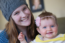
In the template I designed, I wanted it to look as if it were a calendar. It was nice since I started on the 1st of June. I used the dimensions of 5540 px wide x 2145 px high that were given in the instructions. Then I inserted a solid fill layer, made shapes, added text, and that basically made my template. To add the pictures I put each individual photo above the shape that I wanted it to go in. Next, I sized it down around the size it needed to be, right clicked the layer and choose 'create clipping mask' . Then I could really see what was inside the shape, and size it appropriately. I continued this until each shape was filled. Then I added the text for each number. To post on the blog, I sized it down to the long side at 700 px.
5 comments:
I really like your template. Its simple, so it doesn't distract from your photos.
YOu did a great job on your template. I also liked how you placed your pictures and the ones you selected to go in each spaced. Great job!
Nice simple template. Makes for easy viewing and it's fun to look at.
Your template turned out great! I love how it is so simple. It doesn't distract from your photos at all, but it is still really eye catching.
I like how you labeled the date rather than the day of the week. Clever! Nice colors and placement. Very nice work!
Post a Comment